Dataviz.Garden
Powered by 🌱Roam GardenEmma Cosh – Visual Design Principles for Data Visualisation
talk by Emma Cosh at DataVizLive 2020.
developed by German scientists in 1920s and 1930s
describe how humans see objects, recognise patterns, and interpret complex images
certain visual inputs are processed almost instantaneously, at scale, and without the need for attention or effort
make important elements largest and put them “first”
what “first” means differs, e.g. in Europe top-left or center
size and flow
sometimes the core part is not at primary location because user first needs to see contextual data
but what is the core still should be clear, thanks to e.g. size
proximity
place elements that are closely related, or necessary for interpretation, nearby
spacing
be consistent across 3 levels
marks and text that make up a single element (tightest)
closely related elements (tight)
unrelated elements, e.g. section break (least tight)
alignment
vertically or horizontally, to reinforce relationships and add cohesion
proportion
create a sense of unity by sizing element multiples of a base unit
e.g. 10 pixels or 1/4 of the page width
balance and weight
larger, darker or more textured elements have greater visual weight
balance the weight across a central axis to create stability
design grids
make it easy to create good spacing, alignment, balance, and proportion by using a grid to skeleton your view
great tool in corporate style guides
repetition and variety
repetition is satisfying, makes things easy to understand
but can get boring
introduce variety to maintain interest
contrast
high value contrast is for clear distinctions between figure and ground, and between different groupings
don’t use mid-value colors for background
use contrast checkers
color
colors should be purposeful, consistent, culturally aware, and accessible
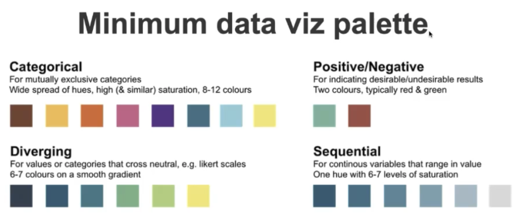
palettes
all below useful in style guides
internal integrity
does the viz contain enough information to be understood if removed from its context
data design critique DataViz checklist
Do we know what’s important and how to move through the view?
size and positioning of elements
Are relationships clear?
proximity, spacing, alignment, balance, design grids
Is everything readable and distinct?
contrast
Are groups and comparative values intuitive to users?
color, size, scale
Is the chart selection right for the data, the story, and the audience?
Are interactions and controls obvious?
discoverability
Will the viz still be meaningful in different context?