Dataviz.Garden
Powered by 🌱Roam GardenDataViz & Tragedy
With Covid19, we've got lots of challenges in front of us. One has been how – or even if – to visualise data about tragic events.
Data for empathy?
Our modern, complex societies abstract most of the things from us. We eat meat but don't hunt animals. We empty our bowels but don't need to deal with the shit. And so on.
The problem is, we can go about destroying our planet or causing deaths to our people without even noticing. I believe dataviz can help with that.
My wife's dad: "I don't take the pandemic too seriously." At a time, when most hospitals in the Czech Republic were full with Covid patients and some of the smaller ones couldn't cope anymore.
But not everyone agrees. Some people think depicting the number of people dying in a pandemic is just a way of exaggerating the problem.
I've heard this from my friends as well as from famous doctors. But those voices are less loud as the pandemic is progressing.
Covid-19 examples
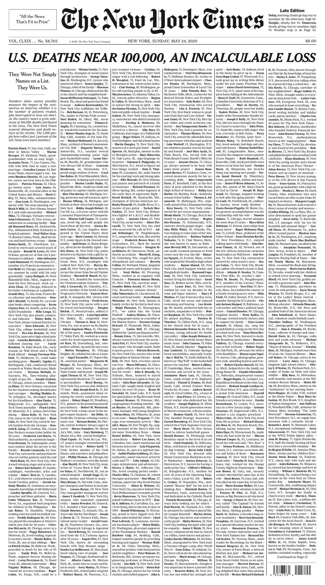
NYTimes front pages
NYTimes depicted the pandemic death toll in the USA:
As a wall of names in May 2020.
In February 2021, this turned into a wall of dots. Names wouldn't fit on the page anymore.
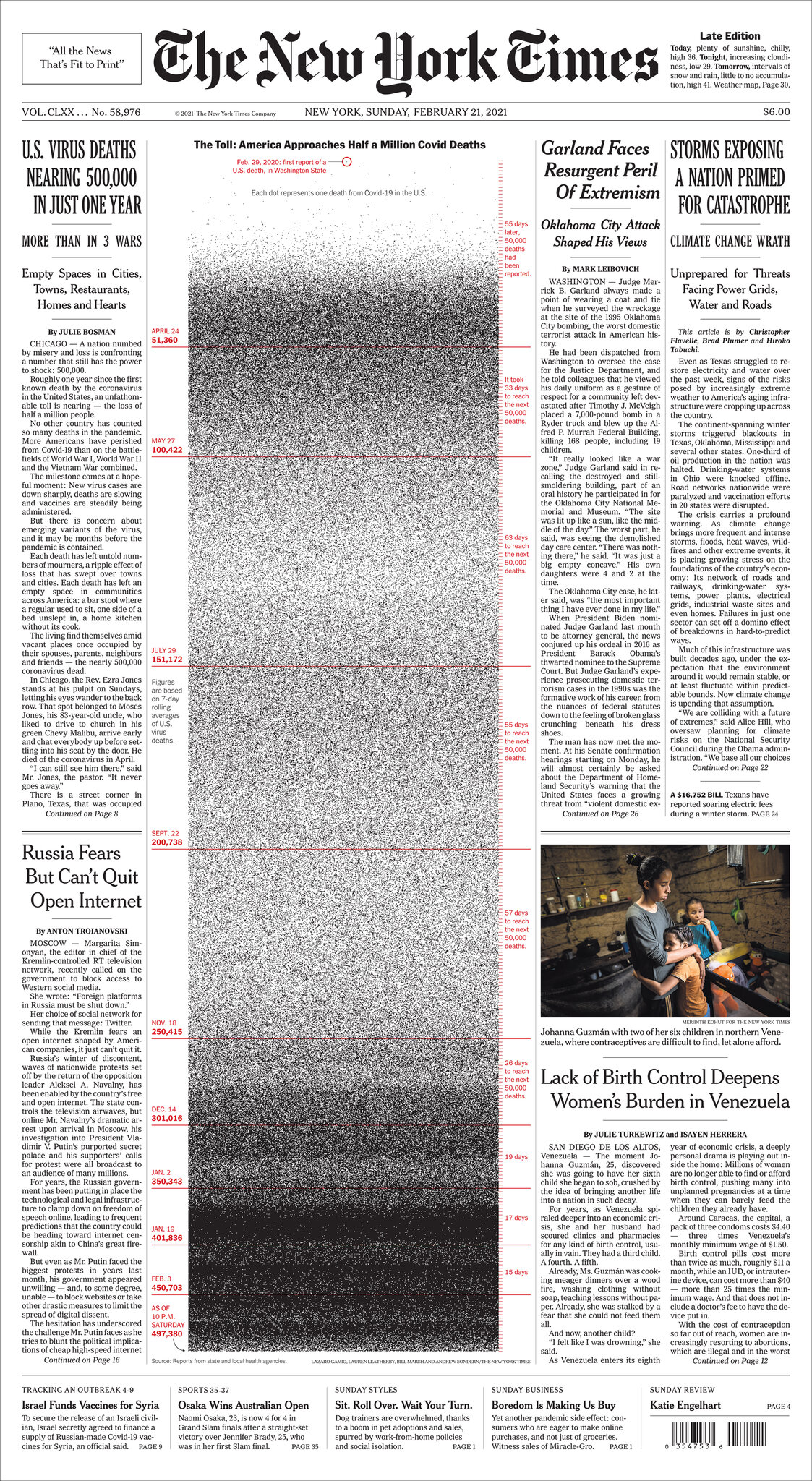
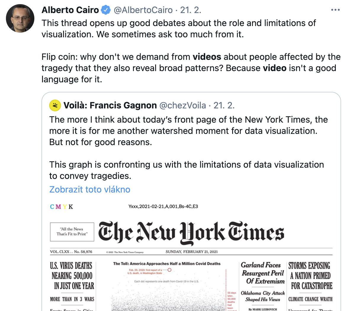
I find this viz great, serious and moving. But Francis Gagnon disagrees:
Turning a person into a dot, which is what data visualization does by nature, is the opposite of conveying the tragedy of death.
But as Alberto Cairo points out, Francis is maybe asking too much of the medium? I don't think dataviz role in the pandemic is to show the horrors of dying alone in a hospital (hopefully writers will do that for us). But dataviz is best suited to break the problem of abstracting modern society and show us the scale of the problem, even if we cannot see it with our eyes (because Covid is not like leprosy).
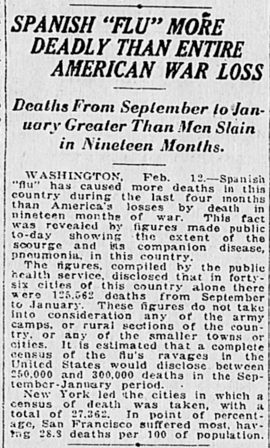
I mean, this is how reporting looked like a hundred years back (via Adam Kucharski):
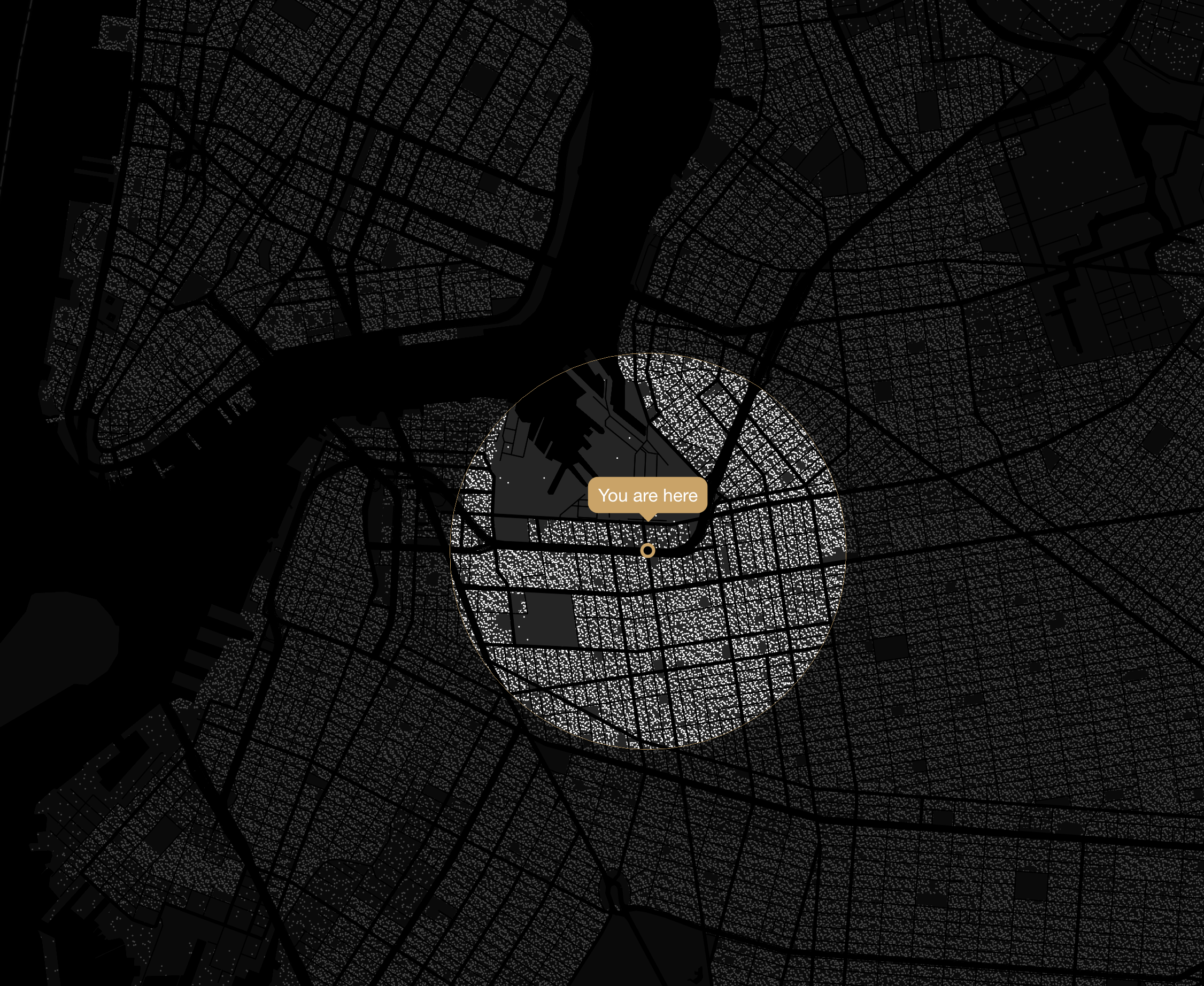
What if all COVID-19 victims were your neighbors?
This project is a Google News Initiative made by a bunch of talented people, including Alberto Cairo. It literally tries to make you feel the pandemic closer to your home... by showing how many people from your neighborhood and beyond would die if Covid spread from your home.
First published in Brasil, later the US version came out in the Washington Post.